The initial version of the Xbox Music software Microsoft released for Windows 8 was a disaster.While Zune devices didn’t exactly set sales records, the Zune Software became somewhat of a staple on the PCs of informed users. Forget Windows Media Player or the two-dozen lightweight third-party clients. If a user wanted a great music listening experience on Windows, the Zune Software is what they downloaded. When first version of Xbox Music debuted, Microsoft began the slow march to castrating the Zune Software, and that castration heightened the stakes for Xbox Music. Users weren’t just hungry for new Microsoft-made music software – they desperate for it.
In the end that hunger, plus the very unfinished and untamed nature of Xbox Music’s design, left a bitter taste in user’s mouths. Last year’s Xbox Music client was so hated that Microsoft practically tripped over itself in announcing that it was going back to square one for the version included in Windows 8.1.
So how does this new version stack up against the Microsoft media clients of yore?
[divider] Design / Interface [/divider]Design / Interface
You’d think that an overly black and white interface would be drab or unattractive. Ironically, Xbox Music version two pulls off the new colors pretty well.
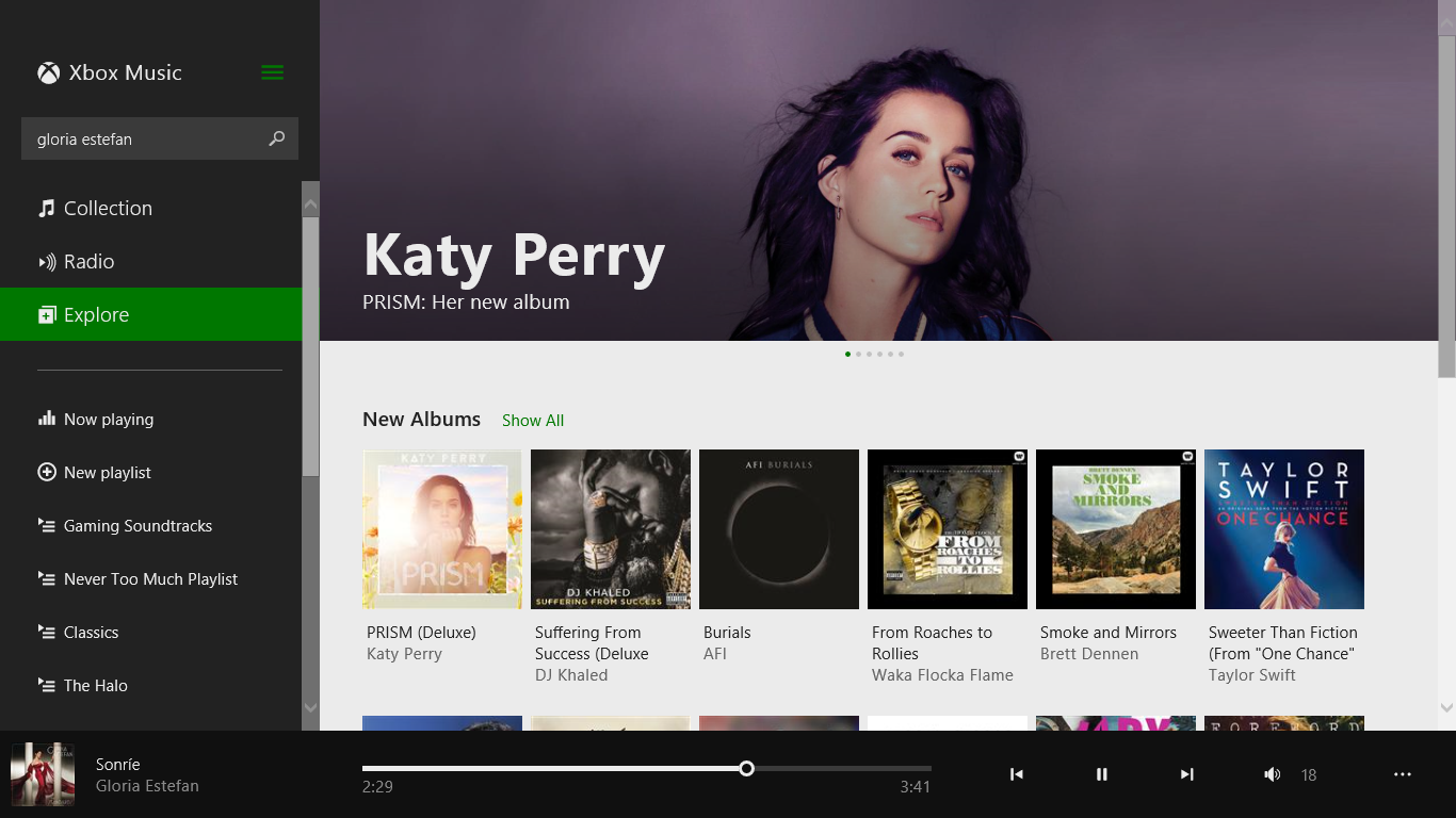
This new design eschews the tile and happy design of yore and simply moves content options to a sidebar that shrinks and grows as users resize the application. Search functionality, radio playlist creation and the option to create and start custom playlists are also included on the sidebar. Its in-your-face without being in your face. The bar also serves as a nice navigation window for creating radio stations, playing music from user’s hard drive and cloud collection and simply streaming music from the store.
About the only miss here is the rather boring interface of the Xbox Music store, but I’m unsure if the service’s decision to hide nearly all of editorial content is what is actually making it feel like it’s a bare bones shopping experience.
There’s a lot to like here. Other than the unceremonious renaming of the Xbox Music Marketplace to just “Explore”, I’m loving all of it. I can’t understand is why there isn’t some kind of Now Playing screen. The “Now Playing” area in last year’s version of Xbox Music wasn’t all that great looking but at least it was something.
[two_third_last] [divider] Unique Features / Functionality [/divider]Unique Features / Functionality
Microsoft is still pushing the Xbox Music Pass and free music streaming hard in this client. Of course 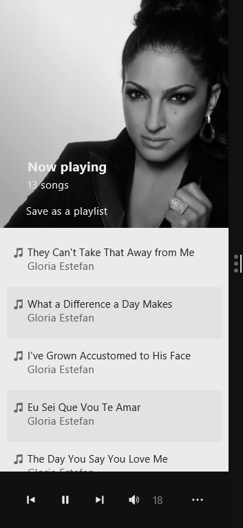 they should be attempting to upsell users. Xbox Music Pass and free music streaming are one of the key things that set Xbox Music. However, unlike last year’s version neither feature feels pushed on users to the detriment of their own content. Users can see their stuff front and center, no more having to head to Settings to enable a collection view.
Cloud syncing is still there, though it feels just a bit more seamless than before. Provided that a user has an Xbox Music subscription their music just travels with them. All syncing for any kind of content should be this seamless and easy.
A few strange feature gaps remain. Both curated playlists made by Xbox Music editors are missing from the Xbox Music in Windows as is music video streaming. If I can see it Xbox Music for the Xbox 360 it should be available in this application.
[divider] Use of Platform [/divider]
Use of Platform
As Xbox Music is installed on every PC by default, it needs to act as a showcase for the platform. Xbox Music includes every feature that makes Windows 8.1 unique. Users can seamlessly multitask using its new fluid transformations. At each position the entire design adapts to the screen size it has available to it. It’s pretty slick and pretty damn useful.
Another potentially useful is the new Share to Music feature. Users can have Xbox Music create playlists based on information shared from a web page. It’s about the only big new feature here, it’ll have users breaking down Microsoft’s door once they know it’s there. Unfortunately, Microsoft does a pretty crummy job of explaining it in the app itself.
[/two_third_last][divider] Final Thoughts [/divider]
Final Thoughts
[one_half]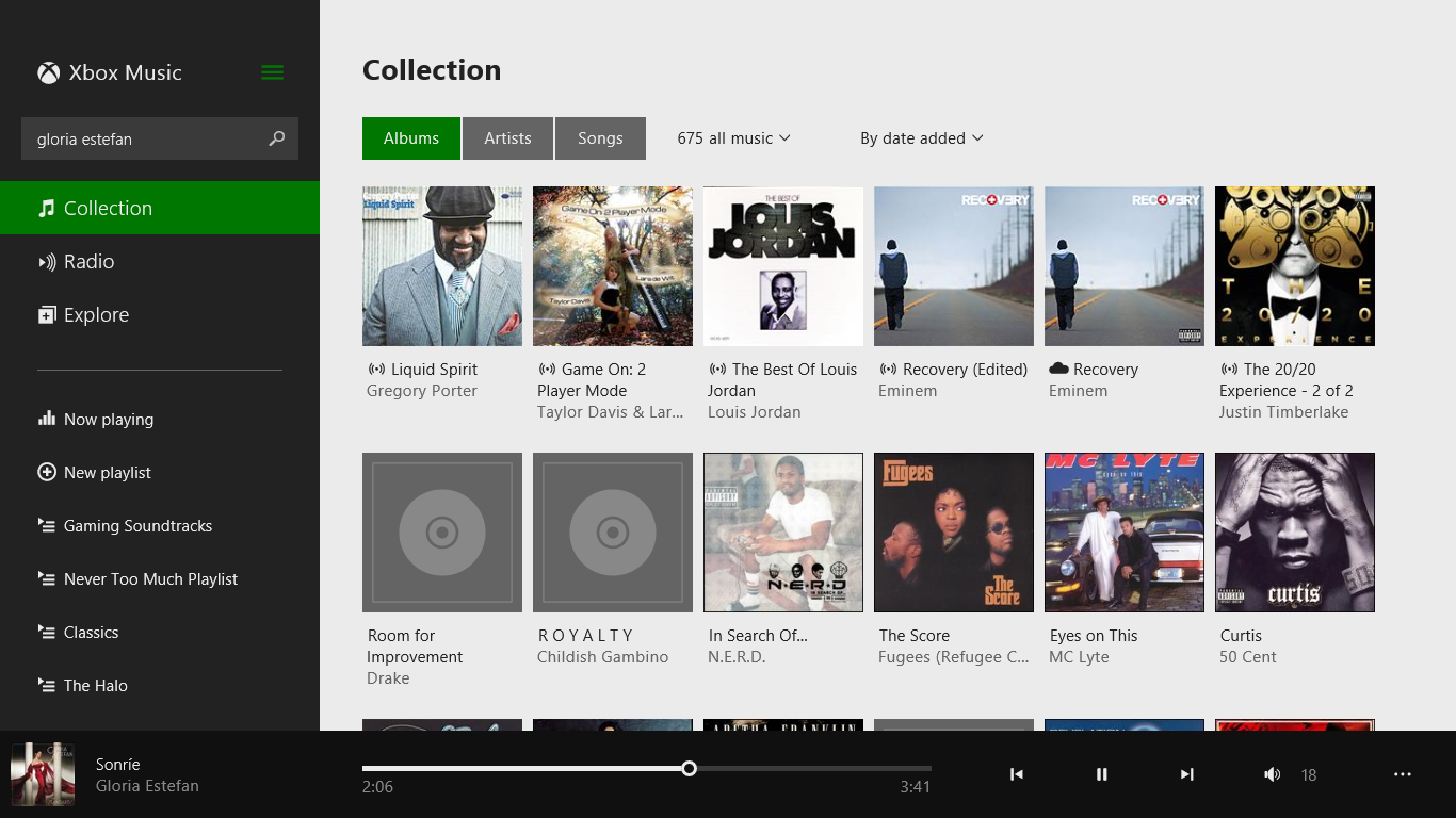 [/one_half]
[one_half_last] Xbox Music for Windows 8.1 isn’t an ocean of new features. In fact, aside from the new design, none of the other requested functionality is here. Users still can’t edit metadata on songs stored on their PCs. I don’t even know how that keeps slipping past them. I’m also patiently waiting for Microsoft to reintroduce the wealth of editorial content the Zune Marketplace and the Zune Software once provided. Where are the playlists made by cool people who stay out all night to see bands I’ve never heard of?
[/one_half]
[one_half_last] Xbox Music for Windows 8.1 isn’t an ocean of new features. In fact, aside from the new design, none of the other requested functionality is here. Users still can’t edit metadata on songs stored on their PCs. I don’t even know how that keeps slipping past them. I’m also patiently waiting for Microsoft to reintroduce the wealth of editorial content the Zune Marketplace and the Zune Software once provided. Where are the playlists made by cool people who stay out all night to see bands I’ve never heard of?
This update to Xbox Music serves as Microsoft’s return to credibility as a music platform – almost. If I had to put my finger on it I’d wager that the problem longtime Zune users and admirers had about the first version of Xbox Music is still here. Both versions of Xbox Music feel utilitarian in nature.
You simply don’t get the same feeling you once did browsing for new music. As Microsoft is competing with music services turned lifestyle brands like Spotify, it needs to nail that vibe sooner or later.
[/one_half_last]Nevertheless, this new design is pretty robust considering the limited nature of Windows Store applications. Unlike last year’s disaster, this is a base they can build on and improve on over time.
If you’ve got a Windows laptop, desktop or tablet running Windows 8.1 give this app a try at least. Its that much of an improvement.
| Review: Xbox Music on Windows 8.1