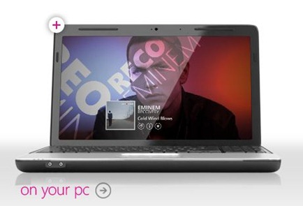
While we were all recovering from our weekends it seems Microsoft unleashed a visual refresh on Zune.net. Among it’s new features includes a very clever carousel animation for different parts of the Zune ecosystem. If you think doesn’t seem like enough of a big deal to warrant flaunting, you are completely right. You know what does? We may have our first picture of the next version of the Zune Software. 
This the Zune software as it looks from the computer displayed on the front page of Zune.net. If you look closely you’ll find that the software you are using right now has the same Now Playing controls. What’s different? They are all on the right of your screen not the left. See:
To be clear none of us can be sure that this is indeed a glimpse into the future of the Zune Software. What we can say is that this pictures is on an official Zune site, and is clearly different the software we’re using right now. You be the judge.

