Now that it has a little bit of time in between announcing the Xbox One and showing off more features for the console at this year’s Electronic Entertainment Expo, Microsoft is now detailing some of the design processes and thinking that went into creating the Xbox 360’s successor.
Xbox Wire has a terrifically detailed piece that goes into how hard the company worked on both the hardware and software for the Xbox One. It’s a long read, so you’ll definitely went to set aside some time to take it all in.
According to Microsoft, the company wanted to combine the Metro interface from products like Windows Phone and Windows 8 with it aesthetics it new consumers would appreciate. It also wanted to include the design language of the of the console with inside the Xbox ONE UI, according to Ramiro Torres, the Creative Director for the console.
“The design language is visible in Xbox One’s hardware. The console is evenly divided between the matte and gloss –the front in particular clearly reflects this symmetry– and the top brings together two even rectangles, where the vent panel’s edge detail matches the appearance of a selected tile in the user interface. ” – Ramiro Torres
Those who wondered why Microsoft chose to create a pure black console this time instead of the white it choose to use in the 360, the company apparently wanted to use what it calls a “liquid black” color to better help the console and it’s components blend in with the devices users already have.
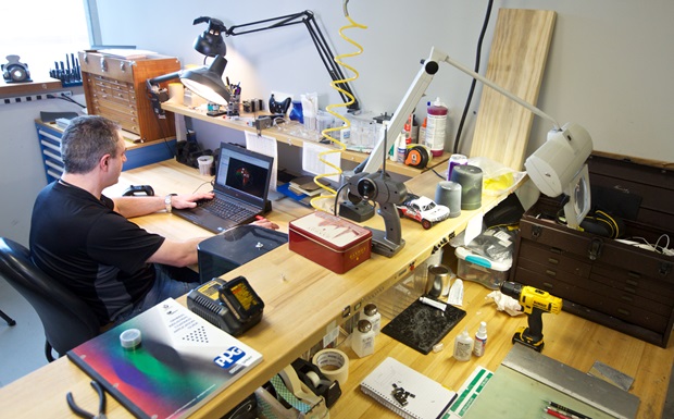
There’s also more information about how the way the company was able to use 3D printers rapidly prototype ideas.
Microsoft says it will launch the Xbox One sometime this fall.

