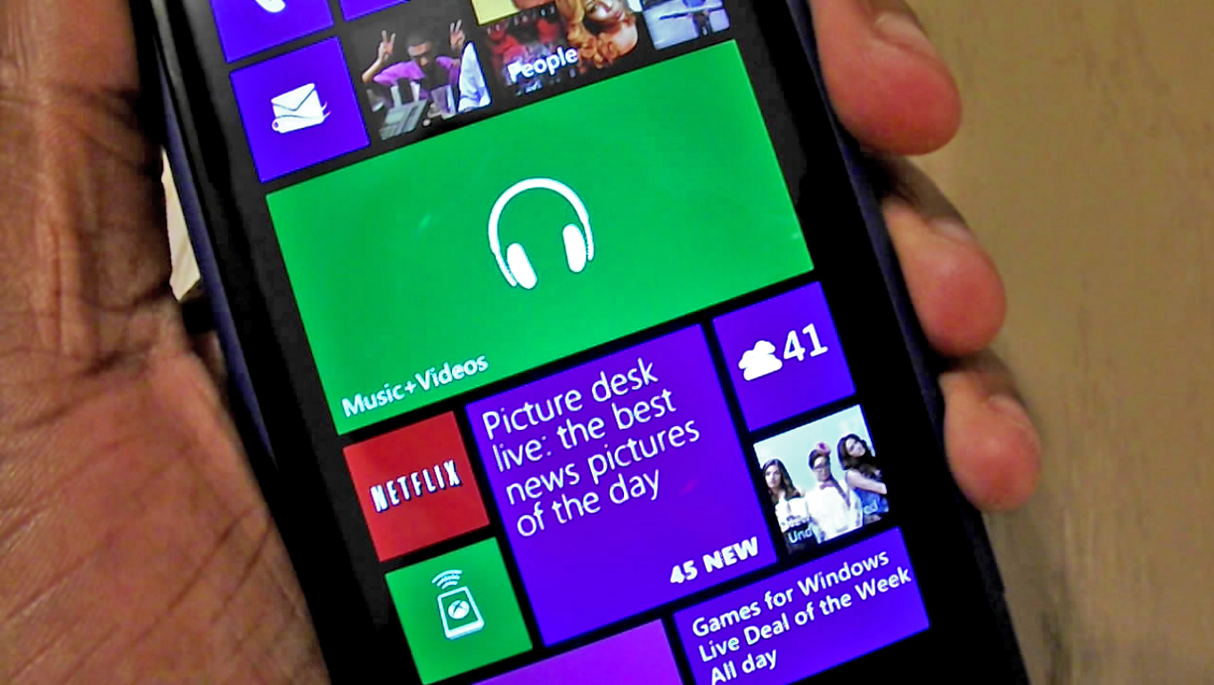
Now, you may think that this doesn’t deserve any real debate or conversation, but it actually does. There’s no question that many want to have the Xbox Music tile, on Windows Phone, animate with the currently playing artist. They want it the way that Zune handled it (moving artist picture with scrolling artist text). It’s quite the nice visual for people who are looking over your shoulder at your phone.
However, in the past few years I’ve seen people debate on that live tile. The debate goes like this: In Windows Phone 7 when you stopped playing music the tile would still leave your last remaining artist on the tile. As it moved into Windows Phone 8, you’d still get the animated tile, but when you stopped playing, the tile went back to the standard tile color.
Many wanted that ‘last played artist’ image to stay and many liked the new version that went back to the standard tile color. So I ask you readers this: It appears that Xbox Music will bring back live tile functionality to Windows Phone 8,1 but what should that entail? Should the last played artist stay there? Should it go back to the standard tile color? Should it be a flipping tile that also shows information about last song played? Should it show album cover anywhere?
Let’s dive into this for a minute. What would your ideal Xbox Music on Windows Phone live tile do?

I’d like to have the tile show artist/album photos and scrolling text just like the ZuneHD during music playback. When the music stops, show the headphone logo on a transparent tile. A full screen music pic/text display OPTION would be kind of cool too.
Having installed the Developer Preview, there is so much wrong with Xbox Music on Windows Phone now, the live I tile is the least of my worries. However, considering they have brought the nice now playing screen back to the Windows version, I would agree that the old WP7.5 tile would be great. Another would be when music is not playing to cycle through your media library.