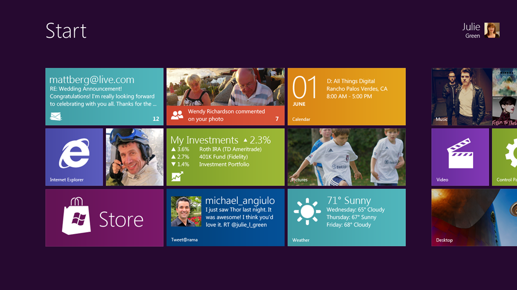
As I write this I’m being hurtled across the country in a 30 ton tube with wings attached from Microsoft’s Global Most Valuable Professional Summit in Redmond, and while that disturbing fact should be the only thing on my mind at the moment I find myself thinking more about the next version of Windows than my chances of never making it home again. (Let me confirm your suspicions, I’m deathly afraid of flying and have in my possession a completely demented sense of humor. The two don’t mix well.)
Many a blogger this week were up in arms about the things that Microsoft is bringing to the table with Windows 8. They’ll tell you that their afraid of changing something that works. They’ll tell you that Microsoft Microsoft is throwing out the baby with the bath water. They’ll spin long winded tales of how, in their minds, Windows 8 may be too ambitious. You’ll hear phrases like “touch-first”, used as some kind of ridiculous excuse for believing that Windows 8 leaves those who use a mouse and keyboard behind. You know what I’ll tell you? These people should pull their heads out of their collective rear-ends. Why? Because only someone who’s mind has turned to mush couldn’t comprehend the sheer uptick on usability that Microsoft is bringing to their desktop OS.
In late September I got my grubby little hands on the Windows 8 Developer Preview, and installed it on a spare computer. While intrigued I found that many of the charges leveled by the people above were correct. Many features were completely obtuse and it was very clear that touch had been focused on, and doing something as simple as managing that applications you have running were difficult. The new Start screen felt less like a running environment and more like Windows Media Center -something tacked on and running in the foreground. Still the fundamentals were there and in a Quick Words a few months ago I started to think about the ramifications for what Microsoft was doing, even if I wasn’t completely satisfied with what I’d seen so far.
I’ve now been using the very much updated Windows 8 Consumer Preview for the past week. I’ve worked on it. I’ve played on it. Folks, this is the real deal. They’ve got something here. For starters all the nagging issues concerning the gave you a feeling the Start Menu was just another add-on are now gone due to a decentralization of the taskbar in Desktop mode. You’ll no longer have a Start ‘orb’ or a see desktop button and that really is for the best. The Desktop now feels as it should. A tool for those who need it, but also detached from those who don’t. They’ve now beefed up the gestures you can use with a mouse and enhanced ‘hotspots’. Do you want to get back to the Start Menu? Move the mouse or your finger to the left hand corner. (The Windows Key is going to come in handy ALOT more with this release as well.) Want to checkout your settings for Wi-Fi, screen brightness, etc.? Do the same on the right side of the screen. Want to look at all the apps you are currently using? Move your cursor or finger to the left top corner. My personal favorite is closing metro-style applications. Literally drag the top of the app too the bottom of your screen. Of course you can still do split screens the same way you could with Windows 8 Developer Preview, but now you have semi-decent Preview Apps that support it. Each include Microsoft Account integration.
Speaking of applications, each install includes Xbox LIVE games, Music, Video, Mail, SkyDrive, Messaging, and Pictures. All feature very nice user interfaces. All work to make computing for the 99% as easy and delightful as humanely possible. These apps also feature the greatest thing to come out of Microsoft since Xbox LIVE: Live Tiles and Lock Screen notifications. On the main OS they’ve made it into Windows 8 just as useful as they are on Windows Phone. With Windows 7 I had to be logged in and in my email applications to find out who’d just sent a message or email. Now I can see my next appointment or my messages without typing in my password.
I write all of this to make one plea to all of you. The demise of Microsoft and it’s flagship operating system has been greatly exaggerated by the haters. This thing isn’t just fast and easy to use, unique, and one of a kind. Microsoft is about to hit back at Google and Apple with the force of ten Grinches plus two. The best part of it is Microsoft doesn’t need to move a ridiculous amount of tablets to make this successful. It works well with your finger, your mouse and once this plane lands I can’t wait to see how it’ll work with a remote. Apple has enjoyed a near turbulance free flight so far, but I get the feeling there’s some headwind incoming.

Well said. I also gave the dev preview a spin and liked it but felt that it needed a lot of work. Tried out the consumer preview for a week and found it to be a joy to use. It has now replaced Vista as the OS on my laptop until it expires. It is fast, easy to navigate, and beautiful. I’ve flipped between Metro and desktop apps and haven’t felt like one part was just “bolted on” the other.
Of course, I’m a Windows Phone user who loves it.