What fresh things can you say about a service and an application that has literally appeared on dozens of platforms? What new insight can a review on something that has essentially become the equivalent of indoor plumbing in the world of entertainment? To say that Netflix was an essential app that had to appear in the Windows Store isn’t even up for debate –there was always going to be an app for it, Microsoft would have been certifiably crazy not to make sure of that. However, there was always a possibility that Netflix might choose to sort-of phone it in, that is do essentially the absolute bare minimum. After all Amazon choose to do just that with its Kindle application. I’m very proud to say that Netflix on Windows is nothing of the sort.
[divider]Design [/divider]What’s black and red?
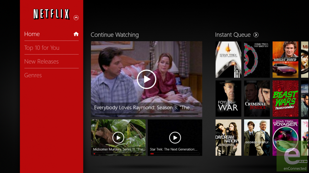
I’ve spent a ridiculous amount of time looking at and evaluating Metro-style applications this past year and during that time I’ve learned two fundamental things. One; user interfaces for these style of applications can be either incredible or absolutely awful. Not only is that not the case with Netflix on Windows but it manages to take the paradigm of a Metro-style app in a new direction with a very attractive fly out menu that starts at the top of the app window and runs all the way to the bottom. I can’t tell you how thrilled I am to not have to look at another pivoting menu in a Windows Store application. You’ll still be scrolling from left to right while browsing content, but I’ll take what I can get. The other thing you’ll notice about Netflix on Windows is the absolutely buttery smooth transitions in every part of the application. These aren’t just for show either. Each one hints on how you should navigate the app. It’s a fine display of digital craftsmanship and one I hope other developers are able to learn soon.
[divider]Features [/divider]And someone said let there be features.
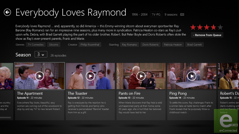
[one_half]Those of you who’ve used Netflix on other Microsoft platforms –Netflix on Windows Phone comes to mind, might have been worried about this possibly being a barebones affair, but let me put your mind at ease right now. Every feature, and I mean every feature you could possibly want is in this thing. Do you enjoy picking the next television show or movie you’ll watch by browsing the meta information of media you are already familiar with? Each television or movie has that data right on the info page. Simply by tapping or clicking on a term, like say Patricia Heaton, will instantly take you to all of her work in the Netflix library. Ratings and captioning are also along for the ride.[/one_half][one_half_last] [/one_half_last] [one_half] [/one_half]
[one_half_last] While many people see Metro as just a look of the app itself, there are also functions that make these apps better than their desktop counterparts. Chief among this are things like the Charms. If browsing the Netflix’s library isn’t your thing you can search the service in real-time via the Search Charm. Snap states are also supported so that you can not only browse but watch a movie or TV show while being free to do other things on your device. Semantic zoom –that is the ability to zoom out of the entire app and browse by category, is also supported. Can I get an Amen? There’s still a few chips left on the table. In fact in the entire time I spent using Netflix on Windows, I only noticed one opportunity that Reed Hastings and his friends passed over. There is no Share Charm support in the application, and that’s a real shame. In the overly social world we live in today, being able to tell my friends with what I’m watching via the service over Twitter, Facebook, or email would have been a nice option. Would my friends have appreciated being pelted with “I’m watching Everybody Loves Raymond on Netflix Instant” tweets? Hell, no, but it’s in a branding opportunity road not travelled and a missed check box.
Also, while it’s not an issue per se, I’d love to see some sort of support for the Devices Charm in a future update so that we could use the app in conjunction with the Xbox 360 and have your movie or tv show pause on your device and start playing on your television seamlessly. Word is that Microsoft’s Xbox apps have that functionality now, and it would make just as much sense for Netflix’s streaming content as it would the Xbox Store’s library. There’s also something to be said about dumping users into Internet Explorer from the setting menu. This needs to be aced as soon as possible. I understand that leaving your information on the web along with the terms of service privacy policy means you don’t have to update an app that had either stored in their code, but there are ways around that. Find one, because every time a user is thrown out of your application and into a loading Internet Explorer page an angel dies from blunt force trauma to the back of the skull.[/one_half_last]

We Say
I began this review by asking what you could possibly say about something as ubiquitous as a Netflix application. As it turns out there’s plenty here to chew on. Netflix on Windows features nearly every feature of it’s iOS and web-based counterparts. Just doing that would have been enough to get by, but the Charms functionality that is included puts the app over the top and supporting many of Windows’s new signature features like snapped states certainly doesn’t hurt. Because of Netflix’s stature as a service the only question we’re left to answer is does Netflix on Windows enhance both the Windows and Netflix experience? Clearly the answer is yes.
| Review: Netflix for Windows 8
