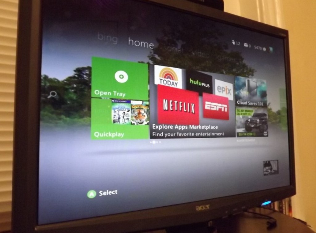
To say that last November’s Xbox Dashboard Update was controversial would be an understand. We’ve received a flood of emails comparing it to Microsoft’s Windows 8 and art work, we’ve also received an equal number of people comparing it’s arrival with that of the The Three Horsemen of The Apocalypse. So, we want to honestly know, what do you like or dislike about the current Xbox Dashboard? We’ll be looking through them and presenting the best of them to a certain interested party named Microsoft.
3 Comments on “CommunityScene: Your Thoughts on The Xbox Dashboard”
Leave a Reply
You must be logged in to post a comment.

This dashboard looks alot better then dashboards of past. Yes I am a fan of the Metro Style look. On start up, the dashboard seems faster to me. The the integration of kinect and the xbox companion app for controlling it. I really do not have anything bad to say about. The one thing most argue about it is the ads. They don’t bug me any. I look at it this way. Xbox Live would cost more if they didn’t have the ads. If you want to complain about the price of XBL, next door is PSN. Go there, be happy, get hacked, experience more downtime.
It took some getting used to, but I think for the most part it works. It will also be better as they add more content because right now it seems theres a lot of redundancy in suggestions. I think the Netflix portion is a bit too busy for my taste. Its like information overload with so much visible at once. I will deal with it though for the smooth add or remove from the Instant Queue capability. Also, text input should be uniform across apps. Sometimes they exchange which button is ‘space’ with ‘back’ and then you have to start typing all over again. The Kinect integration is just straight pimp(and now the kiddos can use the Xbox without putting my controllers at risk of throw, drop or Kool Aid immersion.)
the only thing I do see as a slow down is it takes longer for the Kinect to come online.