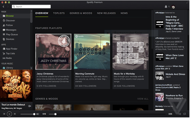
Spotify has updated its Mac & PC software with a hint of minimalism and an altogether different interface.
Designed to get users to focus even more on their collection, artists — and ads if they don’t have a subscription — a new updated user interface for America’s most popular music subscription service began rolling out today.
To be clear, it doesn’t seem like the update includes much in the way of new features as much as it’s just a complete redesign of the features that were already there. Album art and artist pictures have been re-styled in the new design. There’s also a lot of dark spacing, which should allow users to get lost in their music a bit more.
Though The Verge was quick to characterize the design as having “more of a Google+ feel,” were more inclined to just be happy that Spotify no long looks as bad as it did in the last version.
If you’re exciting to get the update, but haven’t gotten it already, you may be waiting awhile. Spotify is rolling out the new updates for Windows and Mac slowly, and unfortunately, it doesn’t allow users to manually trigger updates.
