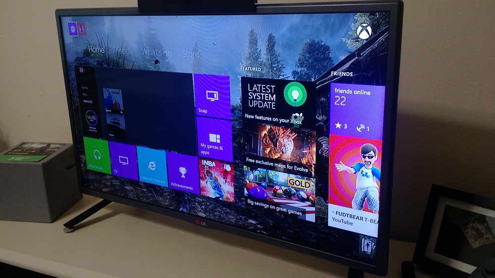
We hear a lot about a video game system’s physical look these days. We see them as these objects, a box and controller that can do more things than we ever dreamed they could. In a new piece of longform at OSTModern, Microsoft’s Matt Akers and others breakdown what it means to design an interface for televisions. The piece is very interesting, especially since Akers worked on the design of the Xbox One’s home screen.
In the recent article Akers points to consistent interactions as an inspiration for how the Xbox One Dashboard works today. The piece focuses on user experience and interaction in the living room and how some companies get it right and some others miss the mark — shout out to Netflix and their decision to drop gesture support for the Kinect for Xbox One sensor. Microsoft’s Eddie Mays is also among those interviewed for the piece.
It’s a fascinating read if you’ve ever wondered why the Xbox Dashboard behaves the way it does or responds to your input in a specific manner. Interestingly enough, Akers previously worked on Microsoft’s Zune Software music and video player.
