At this point, I’ve been using Windows 8 as my main operating system for almost a month. One of the integrated components of the new operating system is a whole new email client. I’ve been testing Windows 8 Mail as my main email client since I started using Windows 8, and I’m ready to share my thoughts.
[divider]Setup [/divider]
Setup
The initial setup of Mail is quick, painless and simple. Simply open the Mail app and start adding your accounts. Within the app, you have the ability to easily set up new Exchange, Gmail (it should be noted, though, that Google Hosted Apps accounts can now be added as Exchange accounts rather than using the old Gmail setup), Yahoo, Hotmail, AOL or “other” email account. Once you initially create an account, the app will automatically begin syncing your last two weeks worth of mail (and, within the app, you can optionally tell Windows 8 whether to sync contacts and calendar information for certain types of accounts).
[divider]Other Options[/divider]
Other Options
Unfortunately, the Mail app seems to be pretty light on other options. The only general option for the app is whether to group messages by conversation or not (which, really, seems like it should be an account setting rather than a general setting, but I guess that’s beside the point).
[divider]Interface[/divider]
Interface
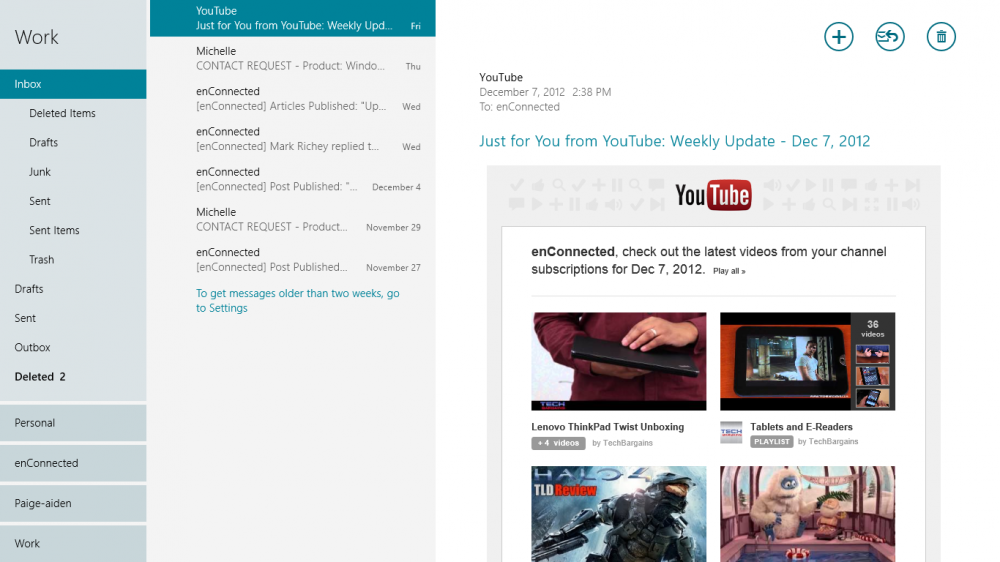
The interface for the Mail app is pretty nice. When viewed full screen or as the larger portion of a split screen, you get your account list to the far left, along with the folder list for the current account. Next to that, in another narrow column, is the list of messages in the current folder. Finally, filling the rest of the screen, you get the preview of the current message.
At the top right of each message are a handful of icons. The first is a plus icon that allows you to compose a new message. Second, you can click an icon to respond in some way to the message (Reply, Reply to All, Forward). Finally, you can click the trash can icon to delete the current message. If you select multiple messages, the respond icon goes away, and you’re left with the icon to compose a new message or to delete the selected messages.
When you being composing a new message, the icons change so that you have a button allowing you to send the message or close it. Clicking the close button will prompt the app to ask you whether you want to save the draft or delete it.
Unfortunately, this seems to be where the simplicity of the app begins to break down.
First of all, the icon bank in the top right is used for all kinds of actions, whether they’re specific to the current message, a group of selected messages, or separate from anything that’s selected (such as composing a new message).
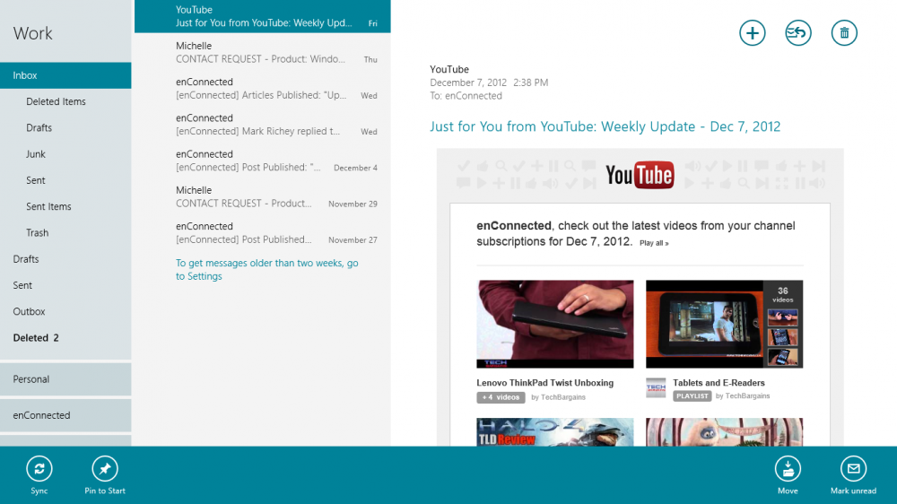
Then, there is a separate bank of icons/buttons that appears at the bottom of the screen when you right-click and/or select multiple messages. Within that second bank of icons, you have the option to move messages, mark them as read/unread, sync the entire account or pin/unpin the account on the Start screen.
I’m not sure of the logic behind putting some icons in the top-right bank and others in the app bar located on the bottom of each screen. I’m guessing that users were evaluated to see what their most common actions were, and the top-right bank was built based on those, while “power user” options were moved to the bottom. However, it would be nice if there was some way to customize that (I find myself using “Move” a lot more frequently than “Delete”).
The act of selecting messages is rather bizarre, as well (at least, on the computer with a mouse – I have no idea how well it translates to a touch-centered interface). If I right-click on a specific message, rather than selecting that message by itself, it adds that message to the current selection (so, if I was reading one message, then decided to take action on a completely different message, I first have to left-click on that different message; otherwise, the first and second messages will both become selected). If I right-click again, it de-selects the message on which I right-clicked, and the action menu disappears from the bottom of the screen.
Moving messages is a bit cumbersome with a mouse, as well. Rather than implementing some sort of drag-and-drop feature, you have to manually select the “Move” action from the bottom of the screen, then select the folder to which you want to move it.
[divider]Other Issues[/divider]
Other Issues
In addition to the interface issues I raised above, there are a handful of other things that bother me  about the Mail app. First is the “Search” aspect. When you use the central Search interface (the only way to search within the app), it only searches the current folder. There does not seem to be any way to expand that search to an entire account or to the entire Mail application.
The other major issue I have with the Mail app is the way it marks messages as “read”. Whenever a new message comes into one of my accounts, if that account is the “active” account I was viewing most recently, that message is marked “read” even if I’ve never seen it. I’m sure this must be some sort of a bug, but it’s extremely frustrating, and it speaks to another missing feature in the app: there is no way to determine how/when a message is automatically marked as having been read. As soon as that message is selected, it’s marked as “read”. You can’t set any sort of delay on that action (for instance, deleting one message automatically opens the next message in the stream, which, in turn, automatically marks that next message as “read”).
Finally, because the Mail aspect of the interface is now completely separate from any sort of tasks, calendar, etc., there doesn’t seem to be any way to manage flags on messages. There is no way to flag a message in the Mail app, and there is no way (short of having a “starred” folder like you get with Gmail) to view just your flagged messages. Normally, this wouldn’t be a huge concern for me, but, when it’s coupled with the dreadful interface for marking messages read/unread, it can begin to cause major issues.
“Moving messages is a bit cumbersome with a mouse, as well. Rather than implementing some sort of drag-and-drop feature, you have to manually select the “Move” action from the bottom of the screen, then select the folder to which you want to move it.”
[divider]Final Thoughts[/divider]
Final Thoughts
I actually love the look, and, for the most part, the functionality of the Mail app. However, the issues I mentioned above are somewhat major, and they’re causing me to have to load up my various Webmail interfaces more than I’d like.
What’s been your experience using the Mail app in Windows 8? Love it? Hate it? Like it with some issues? If you’re running Windows 8 on a tablet (whether it’s a Surface or other), do you encounter the same types of issues I raised above?
[imagebrowser=90]| Review: Mail for Windows 8